Viva’s Blog: Signs that Speak to you
As Brands ramp up their messaging hoping for more interaction with their customers, many consumers are pushing them away. Marketers who deeply understand their customer know that simple is the winning ticket.
Avoid making the common marketer’s mistake of including too many messages in one execution. Tell the reader exactly what they need to know. No more. No less.
Message before beauty. The signs below are not beautiful. The best feature a design aesthetic that matches the brand. All communicate their message succintly.
Here are 5 signs that nailed it.
SIGN #1
This sign, for John’s Used Furniture store in Seattle, is a smart media choice. Nearly every resident who walks by is a potential customer. There are hundreds of apartments nearby that turn frequently (in other words, need inexpensive furniture often) and he delivers for free to all of them, often the same day.
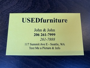
The look and feel of the sign are consistent with the look and feel of the store. His business card is also beautifully consistent with the brand:

Yes, “Used Furniture” is the name of the store.
SIGN #2

Need to differentiate your brand? This barbershop in D.C. astutely advertised its services by highlighting features other barbers may offer but often don’t talk about. And, they understand the power of a few words.
SIGN #3

When you’re selling a small yet pricey condo in Seattle, you want to make sure every visitor knows it comes with spectacular views. What if it’s foggy and there’s limited visibility? You can’t leave it to chance that a prospective buyer knows majestic mountains are within view. Notice the smart sign on the wall: Olympic Mountains. If it’s important, tell them.
SIGN #4

Viva’s favorite, this restaurant in Guanacaste, Costa Rica smartly posted signs along the road leading up to their dining establishment. When there are few choices, all you need to know is that it’s nearby and open.
SIGN #5
Kudos to this sign maker for conveying the tone and spirit of The Renwick Gallery’s “The Art of Burning Man” exhibit in just a few words.
What can you learn from these winning signs?
- Keep it short
- Select one message and communicate it directly
- Be true to your Brand
